Batson Nolan Law Firm Branding
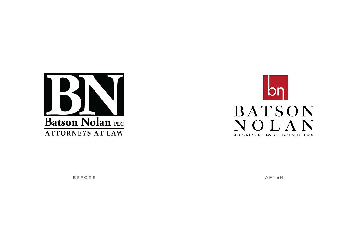
It was requested by our law firm client to create an updated brand logo design from a common letter mark to a fresh, new, and modern design.
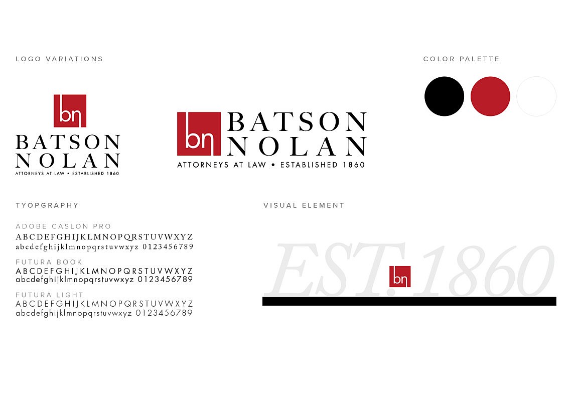
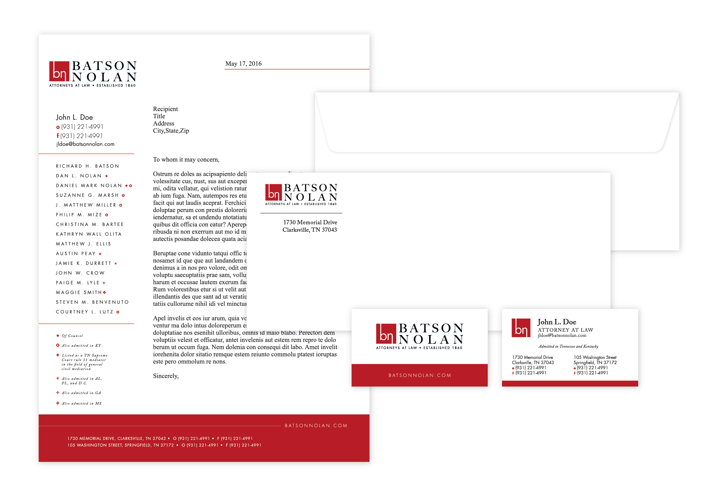
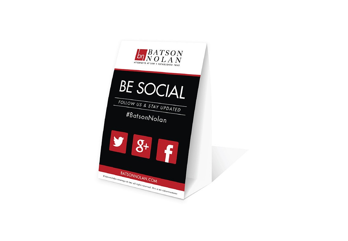
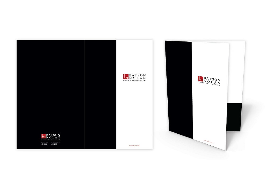
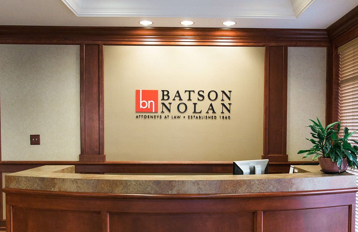
Batson Nolan, a Law Firm in Clarksville, Tn asked us for a rebrand of their law firm logo. The new brand was upgraded using a san serif font and bold red box. We designed logo to stand out among the crowd of lawyers in the Middle Tennessee area.
The BN letters were important to stay in the tradition of the past brand but needed to become something more modern and contemporary and appeal to today’s customers. The square logo design was for balance with the red color selected is to symbolize power, passion, and good luck. Research shows it’s one of the most popular colors in the world. Mixing traditional fonts along with a modern font gave it the perfect mix, balance and feel to communicate they are an established, experienced, strong law firm.
https://batsonnolan.com/