Military Non-Profit Branding
and Graphic Design
Campbell Strong Brand Design
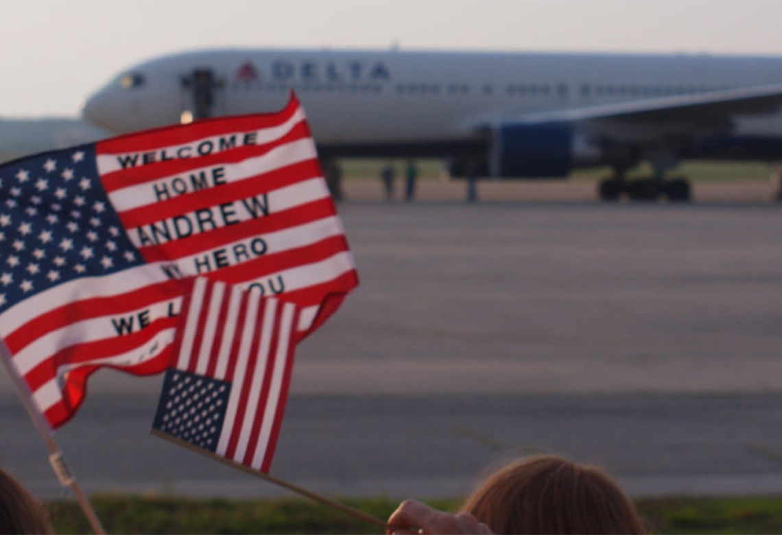
When working with the board of directors and Executive Director on this new non-profit we began with the research and discovery about what this new brand needed to communicate. The key drivers in developing this military community non-profit were to make it feel patriotic, strong, and express unity.
It was important that the brand be original, authentic and American. We began our next phase working on designs that included stripes, stars, while still feeling like a unified strong community. The messaging and the icon both needed to stand alone, be bold, and give the importance of the mission at a glance.
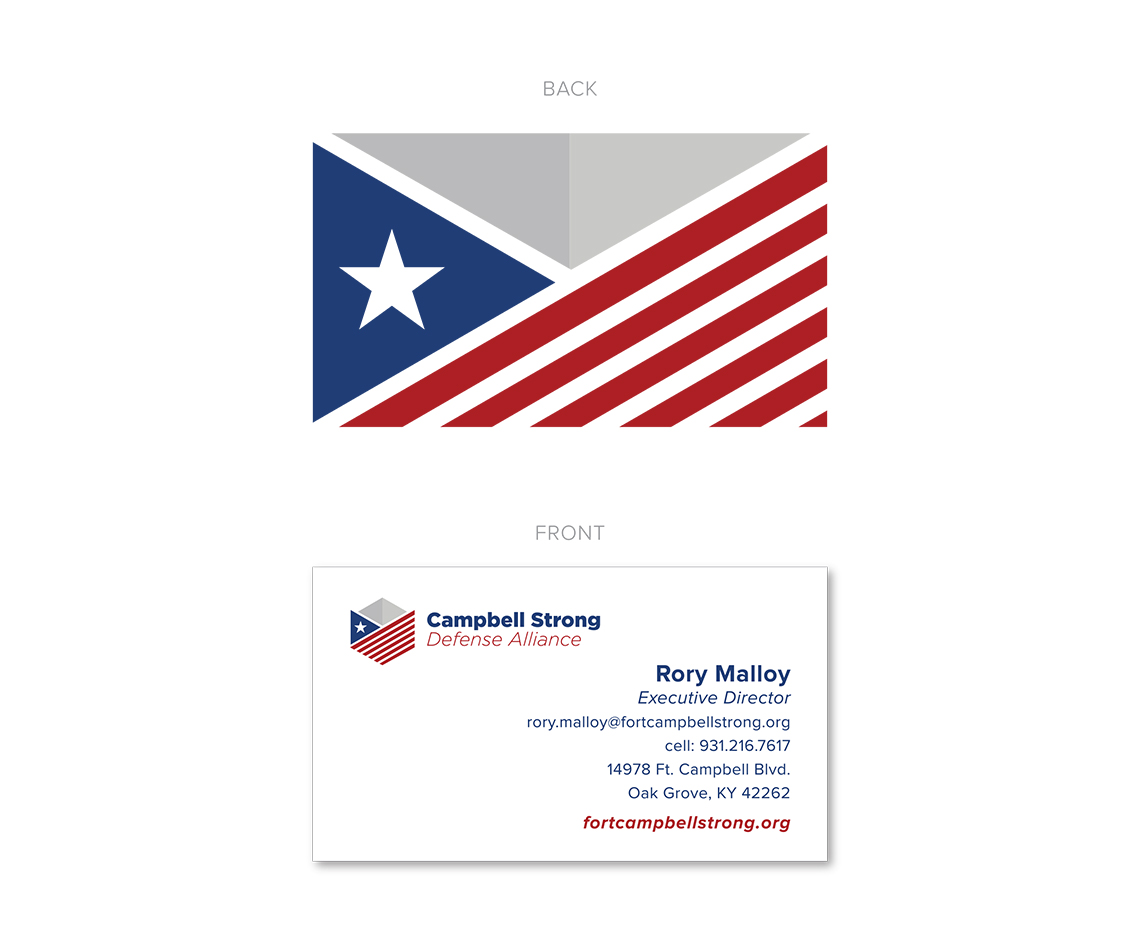
The stripes are in respect to the American flag. The single star to pay tribute the the military, while being a single solid star to show unity. The gray arrow serves as a shield to give it a military badge look and feel to project upward motion, growth and honor.
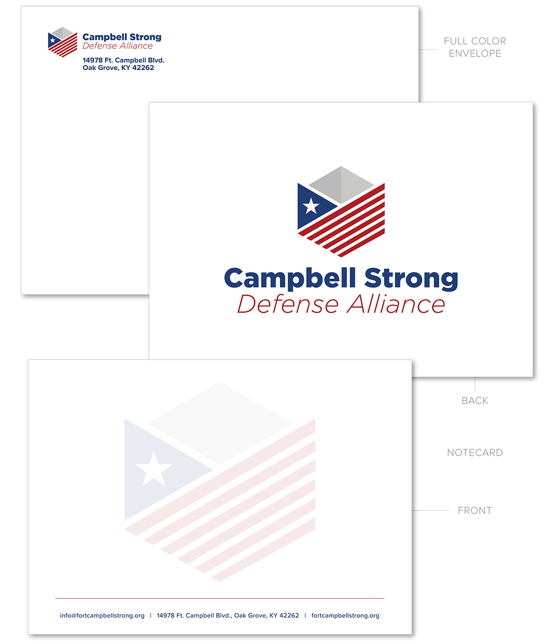
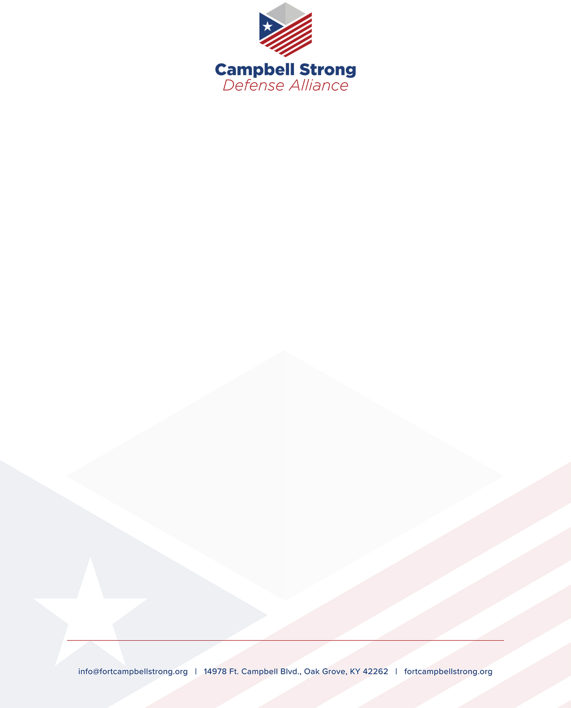
It’s important in branding to have all elements thought through for signage, print collateral, as well as any backgrounds, layout if needed to be horizontal, square, one color, or full color. We also consider in our branding elements for favicons and button styles to echo the brand message and ensure it’s consistent across every piece. See the Campbell Strong award winning website we build here.
The Thrive Creative Group team was more than honored to be a partner for this great organization, it’s leaders in the community and all it is working hard to do for our military community.
Campbell Strong Defense Alliance